Sourced AI research • Last checked Oct 15, 2026
RankLLMs Brand Kit
Download the official RankLLMs Layered Step logo suite, favicons, social graphics, colour tokens and brand guidelines.
The Layered Step identity
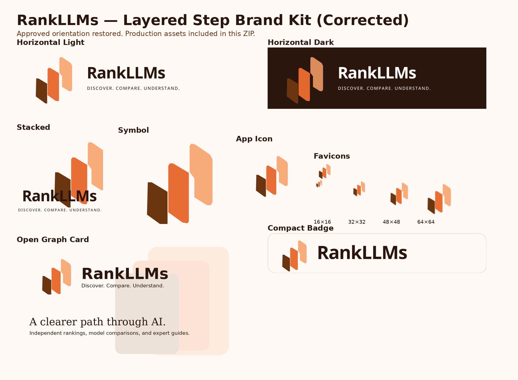
The RankLLMs symbol is built from three ascending panels that represent progression from discovery to comparison to understanding: the dark smallest panel on the left, the copper panel in the middle, and the peach tallest panel on the right. The visible gaps, the overlap and the drop shadow are part of the mark, not decoration.
Layered Step, brand kit v4 • Updated October 2026. These assets are free to use for editorial coverage, linking and non-commercial reference. This package is not a trademark clearance.
Colour system
Six approved values carry the whole identity. Everything else on this site is built from them.
- Obsidian
#2B160DDark canvas, body ink, wordmark on light surfaces
- Deep Copper
#6B360FPrimary text accent, links, darkest step
- Copper
#E86A2EBrand accent, buttons, the middle step
- Peach
#F6A067Highlight step, accent on dark surfaces
- Warm White
#FEF9F4Light canvas, dark-mode wordmark
- Rule
#E7D8CAHairline borders and dividers
CSS custom properties
--rankllms-obsidian: #2B160D;
--rankllms-deep-copper: #6B360F;
--rankllms-copper: #E86A2E;
--rankllms-peach: #F6A067;
--rankllms-warm-white: #FEF9F4;
--rankllms-rule: #E7D8CA;
Typography
Sora
Headings, interface and logoDiscover. Compare. Understand.
Geometric sans. Used for every heading, label and button across the site.
Inter
Interface body copyRankings, pricing and specs you can compare in seconds.
Neutral sans. Used for interface text, tables and data-dense panels.
Source Serif 4
Long-form editorialIndependent analysis of the models behind the benchmarks.
Transitional serif. Used for article prose, reviews and long-form guides.
Logo suite
Every lockup ships as SVG, PNG and PDF. The PNG files are flattened and ready to use; the SVGs carry live text and fall back to a system sans when Sora is unavailable.
Horizontal lockup, no tagline
The same lockup without the supporting line. This is what the site header and footer use.


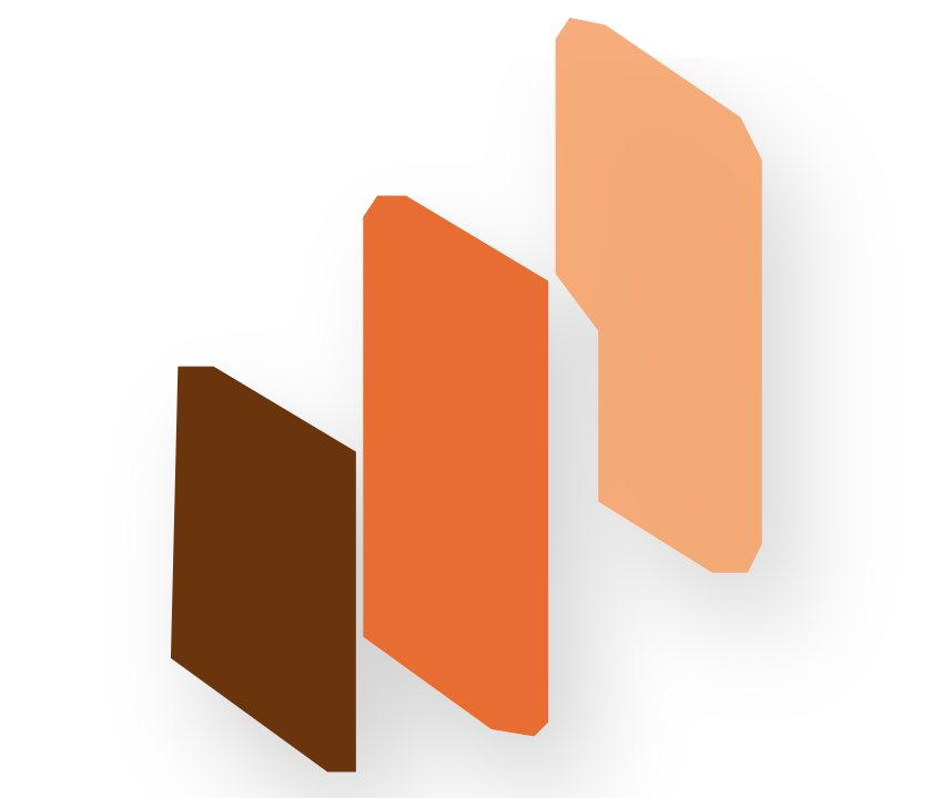
Symbol, monochrome
Black and white single-colour symbols for print, engraving and one-colour placements.
App icon
Symbol on a warm white rounded square for app surfaces, install prompts and tiles.
Favicons and app icons
Square sizes for browser tabs, pinned tabs and platform install surfaces. The vector favicon is fitted to a square canvas so it lines up with the raster sizes.
 Download
favicon.svg
Vector
- Download
favicon.ico
Multi-size
- Download
favicon-16x16.png
16 x 16
- Download
favicon-32x32.png
32 x 32
- Download
favicon-48x48.png
48 x 48
- Download
favicon-64x64.png
64 x 64
- Download
favicon-96x96.png
96 x 96
- Download
apple-touch-icon.png
180 x 180
- Download
android-chrome-192x192.png
192 x 192
- Download
android-chrome-512x512.png
512 x 512
- Download
mstile-150x150.png
150 x 150
Social and share graphics
Open Graph cards for link previews, square posts, avatars and the X and LinkedIn header crops.






Guidelines and web implementation
The written guide, the machine-readable tokens and the copy-ready snippets used on this site.
Using the mark
Do
- Use the horizontal lockup on light backgrounds and the dark lockup on dark backgrounds.
- Keep clear space equal to roughly the height of the capital R around the lockup.
- Keep the horizontal logo at least 120px wide on the web, and the symbol at least 16px.
- Use full-colour assets wherever colour is available, and the monochrome symbols when it is not.
- Reference the approved palette and typefaces in this page rather than approximating them.
Don't
- Do not flip or mirror the symbol: the dark panel stays on the left and the peach panel on the right.
- Do not flatten the three panels into generic bars.
- Do not remove the visible gaps and overlap between the panels.
- Do not change the colour of an individual panel.
- Do not stretch, rotate, recolour or add effects to the logo.
- Do not rebuild the wordmark in another typeface.
Clear space and minimum sizes
- Clear space around the lockup should equal roughly the height of the capital R.
- Horizontal logo: 120px minimum width on the web.
- Symbol only: 16px for a favicon, 24px preferred in interface use.
- Print: 35mm minimum width for the horizontal lockup.
Questions about the brand
If you are covering RankLLMs, building a list of AI models, or writing about model comparisons, the assets above are cleared for editorial use. For anything else, or to request a specific format, use the contact page.
Brand identity and editorial standards are described on the editorial policy page. Data methodology lives on methodology.